 With
today's technology, you can have a web site with features that flash, swoop, tap dance and blare music -- but that doesn't necessarily mean
that all of it is a good idea. Careful thought and planning, more than bells and whistles, will give you a web site that gives your site viewers efficient
access to the information they seek, ensuring that they stay longer and hear what you have to say. Hyla Skudder Design specializes
in clean, efficient but visually rich web designs, for businesses and individuals.
With
today's technology, you can have a web site with features that flash, swoop, tap dance and blare music -- but that doesn't necessarily mean
that all of it is a good idea. Careful thought and planning, more than bells and whistles, will give you a web site that gives your site viewers efficient
access to the information they seek, ensuring that they stay longer and hear what you have to say. Hyla Skudder Design specializes
in clean, efficient but visually rich web designs, for businesses and individuals.
Methodist Theological School in Ohio
Delaware, OH
This was a web site redesign project. The school had a web site that
had been up for a number of years, but it had an awkward side-expanding navigation system, and a self-published look.
The new president wanted to bring the caliber of the school's branding up to a new more academically serious level,
and commissioned Hyla Skudder Design to create a new logo and redesign the web site.
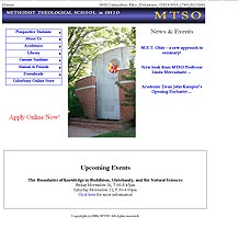 Former web site home page.
In the new site, the page structure was reorganized into more meaningful sections, and navigation was done with vertical drop down menus.
The site was built in partnership with developer David Grunwell through Franklin Computer Services.
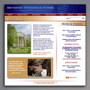 The new home page design. This featured a series of student quotes and photos in the bottom left of most two column pages that faded slowly
in and out on a randomly rotating basis. So as you browsed through the pages of the site, the students' first hand
insights provided a consistent and personal thread.
The new home page design. This featured a series of student quotes and photos in the bottom left of most two column pages that faded slowly
in and out on a randomly rotating basis. So as you browsed through the pages of the site, the students' first hand
insights provided a consistent and personal thread.
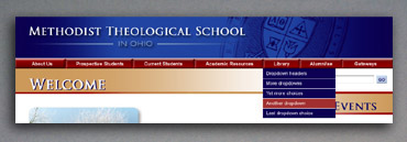 The new dropdown menus with contrasting color hover state to aid site viewers know where they are clicking.
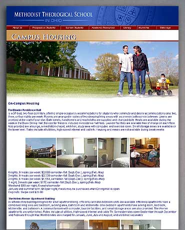 The Campus Housing page showing the alternate single column layout with full width photo header.
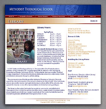 The Library page.
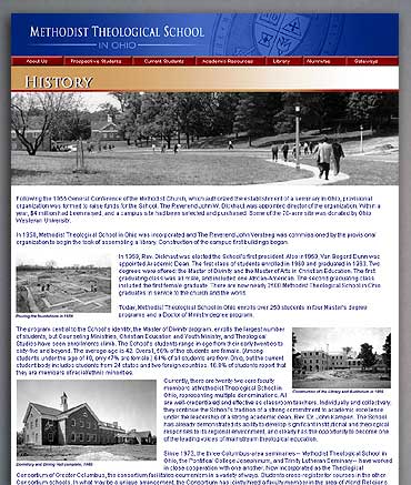 The History page.